
Thank you for visiting!

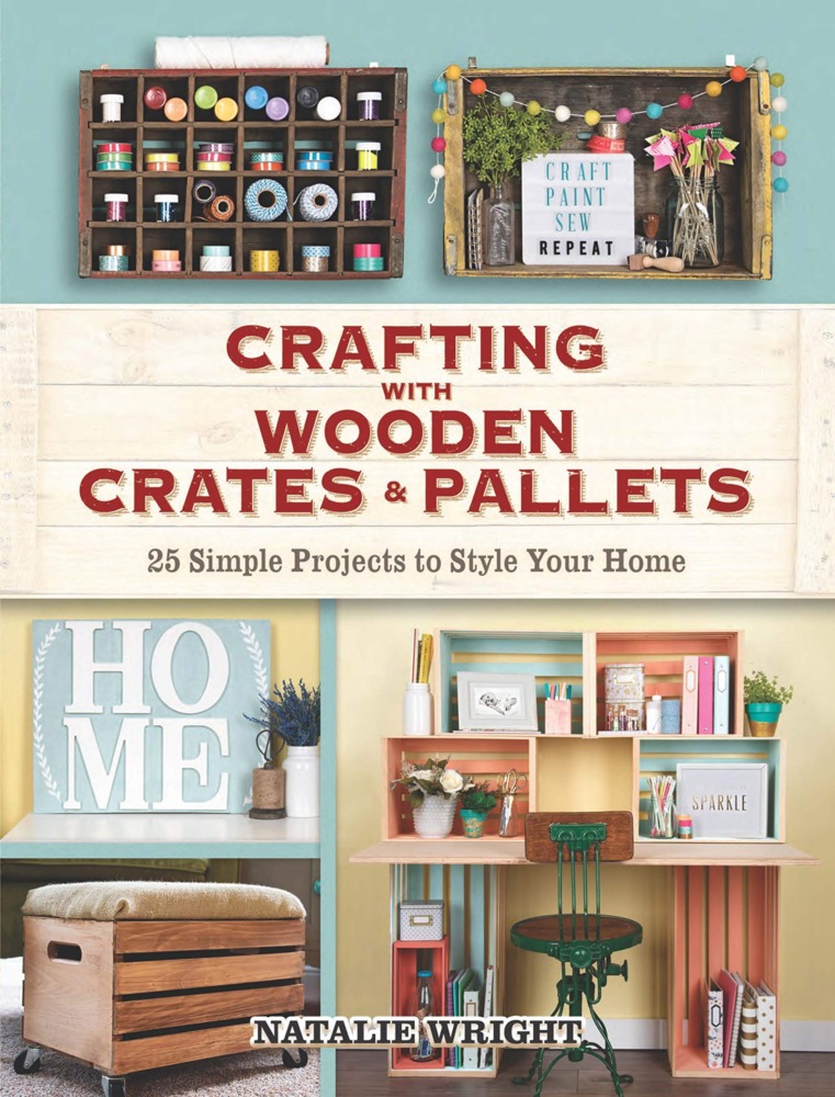
We love the new/old Farmhouse style. To me it seems like “Shabby Chic” crossed with “Shaker Style,” with a bit of Mission, Craftsman or Bungalow styles mixed in. It’s a great way to incorporate simple and aged wooden furnishings in our home decor. However, some of those “aged” furnishings can be awfully expensive, and that just seems contrary to the whole point. So we’re delighted with this book, which is a great guide to making them ourselves. I wasn’t sure we’d be able to make them perfectly, but then I realized that less-than-perfect and literally “homemade” is kind of the point here.
Although my husband has worked briefly finishing “aged” furniture in the past, we don’t consider ourselves much more than beginners, and we found the projects easy to create, fun to make, and a real improvement to our home decor. We do have a staple gun which helped speed things along greatly, and we’d recommend one of those. The book itself is well laid-out, with helpful photos, decorating tips, and very clear instructions.

I lost my extensive collection of calligraphy books in a move years ago. Now that my kids are older, I’m looking to renew my skills and library, but I was unsure where to begin. Original copies of some of my lost books, like this one, can cost $100 online. Imagine my delight in finding this, the classic 1974 handbook on handwriting, republished anew by Dover, at a much reduced price! It’s a classic and authoritative work, written concisely and with brevity.
There are 40 brief chapters in only 100 pages. And yet, it describes (and establishes) the most important premises of lettering — by hand, and by extension, in digital design. I appreciate the short histories and purposes of different lettering elements, such as how italics developed over time. A sample sentence: “Legibility is obviously the first essential virtue of handwriting.” I think that point, and many other similar points, have largely been forgotten, given the hard-to-read digital typefaces one sees everywhere. I think this book is a must for anyone doing handwritten or digital lettering.

The photographs on the cover of “The Colored Pencil” are a giveaway to the artistic direction of this excellent how-to manual for moderate-to-expert artists and illustrators working in colored pencils. Because those are not photographs at all, but colored pencil drawings! If you’ve wondered how to elevate your realistic drawings — or at least your overall ability — to a photo-realistic level, here you go. This is it. I’d been taught that by increasing my overall skill set, I could more easily, capably, and professionally take my artworks in any direction I chose. I believe that, but it’s easier said than done. Even my professional instructors couldn’t really help me toward an ultra realistic approach.
So I’m delighted to read how to actually do it. The section on how to (actually!) draw reflective glass, crystal, and metallic surfaces is worth the price alone. The text is clear and easy to understand with lots of specific tips and pointers, down to the colors of pencils to use on such surfaces, along with common pitfalls and mistakes that won’t work (e.g., metallic pencils are not the answer to drawing metallic surfaces!). So helpful!